 Another drawing done after a russian student drawing from the below mentioned figure drawing book.
Monday, December 28, 2009
Copy #2
Another drawing done after a russian student drawing from the below mentioned figure drawing book.
Tuesday, December 22, 2009
figure #36 *Updated*
Update-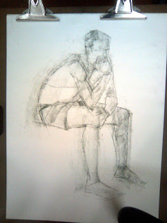 I found this picture taken with my phone of an early stage of the drawing. It will give you an idea of the method. This is about 15 minutes into the 90 minutes drawing. I try to block in and get the gesture right before moving onto any detail.
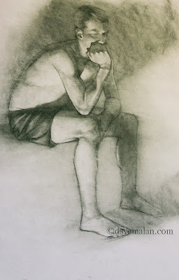 A slightly different arrangement of the lighting made this drawing a 100% more interesting. I was very happy with most of the results.
 I found this picture taken with my phone of an early stage of the drawing. It will give you an idea of the method. This is about 15 minutes into the 90 minutes drawing. I try to block in and get the gesture right before moving onto any detail.
 A slightly different arrangement of the lighting made this drawing a 100% more interesting. I was very happy with most of the results.
Monday, December 21, 2009

Thursday, December 17, 2009

Thursday, December 10, 2009

Tuesday, December 08, 2009
Copy
 I was talking to a young artist recently who told me she never copied, suggesting that it is an incorrect method. I couldn't disagree more, copy everything that you like (don't take credit for it as your own though), the best thing in the world is to learn from the best. Copying forces you to observe closely enough that you actually learn what the artist was doing.
This is a copy of a Russian figure drawing artist from a very good book I recently purchased, done with my .3 mechanical pencil in my sketchbook.
Thursday, December 03, 2009
Painting the classics
At last, here is the process painting done by starting with this drawing and resulting in this painting. It is extremely jumpy because this is a 3 hour painting reduced down to 2 minutes. I also constantly rotate the painting about 60 degrees to judge it(as you can see in the preview), instead of stepping back.
Here's a quick list of the steps:
- 0:05 - initial drawing lifted to its own layer base color put behind it and then paint some flat colors into the areas.
- 0:10 - shadows added on a multiply layer.
- 0:20 - lighting added in screen layer.
- 0:25 - general coloring done with soft light layer.
- 0:30 - direct painting on a normal layer.
- 0:43 - multiplied green layer added, all the layers were flattened then I blurred the whole thing. This is a new trick I am a big fan of currently.
- 0:45 - back to more direct painting to reestablish my edges and refine all on the flattened painting.
- 1:45 - At this point the rendering is basically done so I go through a long process of finish work experimenting with different gradients, glowing, overlays, lighting, etc. until it feels about right (note: it never feels totally right).
Painted in Corel Painter, mostly using the 2b pencil tool, a little digital felt tip pen. Hopefully it helps, let me know if you have questions and I'll do my best to help.
Tuesday, December 01, 2009
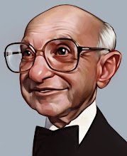
Color
 The color version of the below post. You'll notice the shapes have changed a bit. A new trick I like to use is distorting the drawing in Photoshop before I get into the painting. Often I feel like my drawings are pretty static, the distortion can push it and make the shapes more interesting. While I was painting I thought of a superb little economics lesson by Milton Friedman about a pencil, so I decided to focus his eyes on that.
I plan to get that video up this week. I'll probably say a couple more things about my process in the next post.
Monday, November 23, 2009
More trading
 A new sketch to be traded away.
This has led to a color version and even a process video to be posted soon.
Sunday, November 22, 2009

Thursday, November 19, 2009
I hate this guy
 For the Avalanche blog (not by choice, I assure you).
I had a rough version of this that I thought was probably finished but then some extra time led me to push it more. I'm glad. A little trick you may want to try with your next digital painting. run the blur filter when you think it is getting close to finished, then sharpen the selected areas that need it. This is similar to the method that I use with figure drawing. Build it up, then mash it all down, then build again, repeat as needed.
Monday, November 16, 2009
just one more
And now for something completely different.
 Can you just see those little eyes just begging for another Cheerio.
This is our baby and the reason for my lack of good oil paintings/drawings these days but really how do you put down something like this to paint, I haven't figured it out yet. She's is totally delightful, we're glad we went ahead and got her with all the upgrades.
Wednesday, November 11, 2009
Shadowy
 I found this guy hiding out in my closet, so I painted him. He seemed annoyed but didn't speak much.
Note: This story is not true
Monday, November 09, 2009
colors of the wind

 In a recent post I mentioned some frustration with my own choice of coloring. Here is a new painting of my wife, after the drawing stage I flipped through my piles of reference and found this classical painting done by John Alexander White as my reference for the colors. I went a lot warmer but you get the idea, and it was a good way to use a color palette that turned out a lot more interesting then what I would have chosen otherwise.
I am also satisfied with the limited finish work that left the crosshatch work on certain areas like the jacket.
Wednesday, November 04, 2009
Color Sharpie™
 I was so happy with the drawing I did a color version, This painting was a huge file because of the layers and layers I was using to build up the work.
Monday, November 02, 2009
Sharpie™

I had a request from workmate Casey Nelson for a Halloween poster of a monster family member. This is my contribution done with pencil and a Sharpie pen on a big poster board, I really used to love Sharpies for artwork in high school but these days I rarely get the opportunity to use one.
On the Halloween note check out Kevin Keele's ridiculously cool pumpkin and timely warning about trunk or treating.
Stay tuned for some coloring.
Thursday, October 29, 2009
fig. 38
 We got a little more imaginative with our pose this week. It was more interesting but it comes across as a little awkward which is about right when you hold that kind of pose for 20 minutes. But I was happy with the anatomy and the line work.
Monday, October 26, 2009
Halloween
 I think I started this mad scientist painting 3 times. The colors were not working. So I went to my reference folder and found some art I liked that used colors more effectively and in a more original/interesting way then I am able to come up with. I found this Analogous combo and I like the results.
Stay tuned, more realism is on its way...
Thursday, October 15, 2009
please go away
 And in this weeks "I hate politicians" running series...
I think I got the likeness. Maybe not. I can never tell. I did some initial sketching for this and had a really rough piece. I thought to myself "That is fantastic! It's simple and right on." I looked at it the next day and it was, in reality, truly awful. Thank goodness I didn't show anyone else. I feel better with this but who knows how long that will last. I often feel like everything I do is tired and unoriginal, I think it has a lot to do with the fact that it's all coming out of my head and I already know all of my own tricks. Maybe all artists deal with the same thing?
My dad actually likes Jimmy Carter, I know, I don't want to talk about it.
Monday, October 12, 2009
shadow
 A little painting done just to stay sharp I guess. I am pretty surprised the body worked out because it is almost entirely made up from scratch. The face had some reference but was also heavily altered.
Tuesday, October 06, 2009
bartering
 Some areas of my work have reverted to the barter system lately at least as far as art. Instigated primarily by Virginia Critchfield, a wonderfully talented (and borderline insanely obsessive with her sketchbook, which I endorse) artist. We've been friends for a long while until she very recently abandoned our company. These were the pieces we traded. She has a nice collection on her blog of some of the intracompany bartering.
Wednesday, September 30, 2009
inspiration
 I bought this drawing on the street in Russia years ago. I believe the artists name was Tokerev and this is from the early 1900s. I totally love it and it hangs above my desk in my studio.
Monday, September 28, 2009
Experimentation
 I am always impressed by truly original artists that use wild colors and composition that my mind is incapable of. But one of the best to my thinking is Alex Kanevsky, great rough brushwork, fantastic anemic color palette and intriguing compositions. I should add the point that many in this catagory are epic failures using gimmicks to disguise their lack of talent.
I found this fantastic reference from an old photo, I as usual neglected to write down any information, it may be a famous person, regardless he looks very cool. Then I used the color palette of one of Mr. Kanevsky's nice interior paintings. It's still obvious that my painting lacks the wild rough edges and loose paint strokes, but I try.
Thursday, September 24, 2009

Tuesday, September 22, 2009
portrait
 *note: please look at the larger version before you scoff, I think this thumbnail misses the highlight on her lip and makes the mouth look stupid.
A couple weeks back I did this figure drawing. It's big 18"x24" but turned out nicely. Its done as usual with "Bottle green" NuPastel on sketch paper.
Tuesday, September 15, 2009

Wednesday, September 09, 2009
Football
 I love football just about as much as anything. This year will my first toe dip into the fantasy football world. My team will be called the "Furious goats, because of this logo I've stolen from a previous painting. I understand a lot of my time will be wasted, we shall see.
Thursday, September 03, 2009

Tuesday, September 01, 2009
childhood
 For the Avalanche blog, the theme was something about what I drew as a kid. All I drew as a kid were dinosaurs(or some modern variations like sharks or alligators).
Sunday, August 23, 2009
figure #35
 This Friday's drawing done in my sketchbook. I use a .3mm size lead drafting pencil. I don't know why, I became addicted to the lines a few years back and never got back to the regular pencils. That explains why there is rarely and shading, just crosshatching. I was happy with the likeness here though.
Friday, August 21, 2009
my new secretary
 I have a new ombudsman to deal with the substantial load of criticism coming into my website. He may be a little abrasive but he is eager to solve your problem. Please overlook his rough edges and give him a warm welcome.
I was playing around with a different brush. A little tricky working with edges but forced the more general abstract handling.
Friday, August 14, 2009
Vampire w/ blood
 In keeping with the current societal trend to use vampires in every possible scenario I've continued work on my previous drawing. I desperately don't want to be left behind by any trend or fad. If everybody think it's cool, I completely agree.

Thursday, August 13, 2009
Sketchbook #37
 My wife just got a new magazine with some good reference for my sketchbook. This is last nights study. I asked Natalie what she thought she said "You always draw things long, don't you." That is wife speak for "It's too long." This version is in fact squished to compensate because it is true I always draw things long, it's possible it is the perspective or it may just be in my head, I may want to get that checked.
Monday, August 10, 2009

Sunday, August 02, 2009
finally
 Nu pastel 18"x24"
At long last a figure drawing that I am very happy with. I get comments sometimes about the generally negative view expressed on this blog about my own work. It's true I am very rarely satisfied with my work. I am happy to declare this as probably my best figure drawing ever, technically at least. I am extremely pleased with the result, in my opinion very accurate with good line work and finished to just the right level. There is a good mix of realism and graphic lines.
 So I told my wife how I felt about this and she looked at me like I was crazy then she was good enough to point out that there are no hands. Now it may not be the best composition ever but I actually like it. I really like the non-traditional compositions and this falls within that category. The fact that the hands have been left off is unsettling but intriguing to me, you just have to take my word for it that I can draw hands and this is not just a ploy to hide my inadequacy.
I guess that is enough self congratulation for this post. You are welcome to agree with Natalie, let me know if you think this drawing is mediocre.
Tuesday, July 28, 2009

Tuesday, July 14, 2009
figure #33
 A figure drawing from not too long ago. I thought this guy was awesome to draw he had a really interesting boney figure that was just really interesting, and he was extremely friendly. I was happy with some of the character I got out of the lines especially on that arm though now I wish I had been able to emphasize the great lines even more.
Sorry for the slow progress lately, a new home and the baby who just gets cuter makes art production difficult.
Tuesday, June 30, 2009
Rockwell coloring book

Just an exercise, I thought I would do a little coloring on my Norman Rockwell drawing from a while back.
Thanks for the comments on the previous post. Don't take my writing too seriously, I am often sarcastic which doesn't always get conveyed through text. My wife accuses me of having no feelings because I don't get offended easily. Its a useful skill to deal with art show judges and to pick through to find the criticism that I can use. I don't really fit the passionate artist mold which I'm sure contributes to my analytic approach to my work. I do appreciate critiques though.
Sunday, June 21, 2009
rejected
 14"x 18" Oil on board
"The Other Door," A recent oil painting that was rejected by the big local show. This has happened twice now, I've taken in 2 paintings on 2 separate years that I thought were pretty good. I figured at worst one would be taken but no such luck.
I liked this one. It was actually a very relaxing process, working from a photo we took in Venice it was nice to just paint what was in front of me with no real difficult decisions beyond value and color. I thought the composition was interesting as well, but that may just be me. Maybe it is just too straight forward?
I guess I will have to just find a way to go on.
Tuesday, June 16, 2009
sketchbook #38
 This man landed a plane on water, the least I could do was honor him in my sketchbook.
Wednesday, June 10, 2009
figure drawing #32

Circumstances allowed for a NuPastel drawing this week. I was happy to get back to this mainly because it adds variety to my art exercises. It's pretty different to do the full arm drawing on the 18"x24" sheets.
This was a good model who got the drawing as her reward. It was a tricky pose and she was having trouble keeping the rotation right making it pretty difficult to draw. But I really like standing poses.
Sunday, June 07, 2009
figure #31
 Friday figure drawing. You can see some of the construction work on this one. Standard pose, but I am more pleased with the way these are turning out in my sketchbook they've come under the blanket that is my style.
Tuesday, June 02, 2009
Movie poster
 For the Avalanche blogs most recent topic "The Land of Oz".
Don't worry I too am ready to get back to the more fine art work.
Thursday, May 28, 2009

Tuesday, May 26, 2009
Whitman

I got a great project for the most last issue of The Weekly Standard. It's Meg Whitman, I was happy with the work on the face I like the sculpted feel, but the body is pretty stale IMO, sigh.
Monday, May 18, 2009
Friday's figure drawing
 Usually on Friday's I find time for a figure drawing session. Here is this weeks contribution. I think another half hour of refining could have made it pretty good. I would guess this is more like 1.5 hours.
Wednesday, May 06, 2009

Subscribe to:
Posts (Atom)