Thursday, June 05, 2008

Study


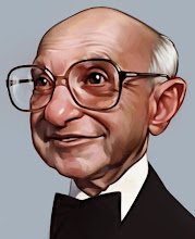
I've started into a pretty ambitious new oil painting it is large with a lot of background (both aren't my usual cup of tea). This is a study for the work, I'm not sure if he is creepy enough though.

It will be a very large painting but it has an appealing composition so hopefully I will have the willpower to see me through to completion.

Monday, June 02, 2008

archives

I did this figure drawing a couple of years back but have always liked it. Those were the blissful days of figure drawing 4 times a week. Now I am just trying to keep my head above water when it comes to figure drawings, though I've been a little more optimistic lately.

Tuesday, May 27, 2008

Old timer

I digital painting based on an 19th century photograph I came across. It was a sepia photo so I had to make up the colors which is difficult for skin tones.

Wednesday, May 21, 2008

Ugolino and his sons

I was in the great city New York recently and had time to sit and draw at the MET. Of course I went directly to my favorite statue: "Ugolino and his sons" by Jean-Baptiste Carpeaux. So for about 2 hours I sat in a conspicuous corner and tried to best my last try at this subject.
In this drawing you can get a good idea of my process, moving up from the bottom you can see I block in the most general shapes and then get more and more detailed shapes, next I begin to work in the shading and finally tighten edges.
Also, if you have any way to get to NY in the next 2 months, there is an absolutely brilliant J.C. Leyendecker show up at the Society of Illustrators with some of the most jaw-dropping work I have ever seen.

Wednesday, May 14, 2008

Conte drawing

A charcoal drawing out of my sketchbook. Even though I use the same type of hard charcoal as my figure drawings I have a lot more control in my sketchbook (it seems). It is Conte which is hard difficult to use because it doesn't erase easily. But I have been able to get good tight flowing lines by using the side of the stick, see the hair.

Wednesday, May 07, 2008

the Poet

This is my take on a poet.
Sorry for the break, took a little trip and saw the beautiful city of Prague and the Bavarian region of Germany. So now I am back and inspired, especially by the Alphonse Mucha work I saw. Mucha is in my opinion the greatest artist of all time, his posters are great but you must see his oil paintings and especially his Slav epic (be sure to visit this link though the images are mediocre) to know what I mean.

in other news, check out the updated clean edges on my previous Sweeney Todd post, thanks Shawn.

Sunday, April 27, 2008

River

My latest, oil on board 18"x24". Based on a previous painting, this one has much a stronger drawing(I only realized right now as I look back at the post). I like the nontraditional composition, slightly graphic. It sits against the wall in my studio for a month or two now and I still like it, whenever I don't hate it after a couple of hours that is a good thing. My wife still has issues with it and I plan on some light changes but it's basically there.

Wednesday, April 23, 2008

after Fechin

This is a Nicolai Fechin (1881-1951) copy done in charcoal about a year ago. There are some proportion problems but I am pleased with the linework and the drawing as a whole, especially when looked at independent of it's source.

Thursday, April 17, 2008

Royalty

A painting I found in a dark hallway of a rich Bavarian castle. Actually I just painted it and added the frame digitally. I want to print out one of these digital paintings on canvas and frame it nicely some day, some day.

Thursday, April 10, 2008

Monday, April 07, 2008

Green

I am going green!(but only in the background of certain paintings)
I painted this a couple years ago and really kind of like it. It's my wife again but this one had a more quickly painted, in a more simple style. The background turned out well because of it's contrasting color and the looseness, in my opinion. I really liked the background behind her but it got a little mushy looking in the front. Truth is, loose painting is very much harder then tight. Oil on board 11"x14"

Wednesday, April 02, 2008

figure drawing 7?

So only Ken was kind enough to feign interest in my previous post so here is a figure drawing that may or may not draw more attention.
I am always curious to know whether people come primarily for the traditional style or the caricatures and whether the caricature posts drives traditional people away and vice a versa. Maybe I need to create a pseudonym and post art under that name to gauge the popularity then I will organize a street fight pitting the traditionalists against the cartoonists, to the death.

Thursday, March 27, 2008

Norman Rockwell

I just returned from the east coast, seeing a lot of great art that is much more accessible then out here in the west. I found a couple beautiful Norman Rockwell paintings, it's sad that its still rare to find these treasures done by the golden age illustrators. I visited a couple of modern art galleries where collectively the work didn't equal a single good Rockwell in my eyes.
I found this fantastic photo of Rockwell painting the hard part was stopping. I like the graphic shape/composition of the unfinished piece. I am also trying to push my values and shading, I used to do fully shaded drawings always but have lost the patience for it more recently.

Monday, March 17, 2008

Sweeney Todd

A new digital painting I really like. I painted it with the dull green background and kept all of his values very muted then thought of the blood in the background idea, which I think works extremely well to punch it with the contrast. Sometimes my digital paintings are done on the fly, on a whim, this one was a little more planned out and I think that helped. Also, initially I wanted a solid graphic shape for the hair similar to Sebastian's Tim Burton painting that was so effective. But once I got into it I couldn't stop, I really enjoy painting hair.
I'm having this agrivating problem with the blood and the red name turning fuzzy when I publish it. The jpg is sharp, sorry. Anyway, hope you like it.

Tuesday, March 11, 2008

Brandywine

This is a newer painting. A lot of glare is showing up in this picture but you get the idea. I wanted a warm face to contrast with a very cool background. I also was trying to get a loose style in the background to compliment the more finished face.
This is oil on board 12"x24".

Sunday, March 09, 2008

Figure drawing


A newer figure drawing done at work.

Monday, March 03, 2008

Birthday surprise

A new painting done from an old concept that I could never get the colors that I wanted. I did the drawing a few months back and tried 2-3 times to paint it up but kept getting stuck with bad colors. I've decided it may have come subconsciously from the Godfather part II, doesn't it look like Hyman Roth? Remember that whole scene cutting the cake in Cuba?

Wednesday, February 20, 2008

painting progress

Monday was a holiday, I spent 7 blissful hours painting. Here is a mostly finished new painting. One thing I was trying for was more of a vibrant pink shirt which I was unable to accomplish with the paints colors that I use. I use just the main colors red, blue, white, etc. then mix the colors that I want, but it is very hard to get some colors, vibrant pink is one of them(greens are hard too). One thing that was interesting was really pushing the bright reflected red under her chin.

Wednesday, February 06, 2008

Snow girl

A new digital painting loosely intended for the Avalanche blog. I did a drawing I liked and wanted an interesting background and color scheme. Like I've said before I have a hard time staying interested beyond the face.

Sunday, February 03, 2008

painted kids

I have had a renewed vigor for oil painting recently. This is the painted version of this drawing of our beautiful little neighbor girl. I mentioned that I wanted to get the more spontanious style of my drawing into my paintings. You'll notice that more time was put into the face, especially around the eyes, then quicker work in the less important surrounding area. I really like to take 2-3 overlays in the white areas so it will really glow with the reflecting light when lit correctly(or sunlight). Done in oil on 11"x14" masonite board.

Friday, January 25, 2008

Angel

This is a Painter painting. I don't have much more to say. Ryan Wood gave me all kinds of good advice on finishing the thing, and it worked.
Thanks to Eric Francis for recognizing my site.

Monday, January 21, 2008

Natalie drawing

I've been thinking about how I am often more happy with my quick drawings than I am with my much more time consuming oil paintings. Mainly it's the many years of practice in my sketchbook that has allowed more freedom and confidence in my linework, I am trying to get more of that into my paintings. So I did this drawing to transfer into a painting in the hopes that it will help me with a loose painting that I am happy with.
I did one with the baby drawing below that I am pleased with and will post in a few days.

Wednesday, January 16, 2008

profile

A painting done a couple years ago done 12"x24" on a board. I gave it to my wife though, she likes paintings of herself.

Thursday, January 10, 2008

Putin

A new paiting, I am trying to get a few good caricatures together. Ussually I try to use strong colors against a muted background to emphasize the subject, but in this case I tried to reverse that with a muted character on a vibrant background, reverse the contrast.

Monday, January 07, 2008

kids

This is our friends kid, if you haven't drawn kids for a while you should try it. Its difficult, this is probably the fourth attempt to get the head structure right.
Also you may notice the other drawing overlapping on the lower right corner, I mess up a lot of my drawings trying to fit them into the page.

Wednesday, January 02, 2008

electioneering

Campaign season again.
I was a lot happier with the likeness on this one. Just like anything else you get rusty without practice.

Wednesday, December 26, 2007

Monday, December 17, 2007

Peres

A drawing of Shimon Peres, I did it for Bryan Larsen's guest sketchbook, Bryan's a great artist check out his portfolio or the blog. Bryan's blog has a closer look at the drawing, but for this one I wanted to use an old composition style. Maybe you've seen old portrait drawings that are small and centered on a large paper allowing a lot of empty space to frame the drawing. Pencil on paper, the old paper texture was also added afterwords for interest.

Tuesday, December 11, 2007

Brushes

I have been fielding a lot of questions about the brushes I use so I thought I would just post it so I could refer people here in the future. (These are in Corel Painter)
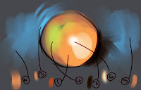

This picture is a nearly comprehensive list of the brushes that I use in order of their frequency:

1-This is a custom brush made by the great Ryan Wood(you can probably make something similar using a round oil pastel brush and adjusting in the brush editor). It is really basic, I like that it picks up some of the underlying color and is a solid stroke.

2-The felt tip pen, I use this brush for nearly all line work and sometimes to darken areas. As I begin to lose the structure of a painting I use the hard felt lines to reestablish those interesting shapes.(example)

3-2B-pencil, very useful basic soft edge, all-purpose tool. I can soften edges, do linework, and fix blending areas.(example)

4-Digital airbrush, similar to 2B but it creates kind of a diffusion with random colors, sometimes I want the color variation,usually just on the underpainting.

5-Smeary wet sponge 160, sometimes a cool tool for grainy edges and building up color.(example)

6-F-X Glow brush sometimes useful for lighting up an area or adding highlights, I rarely use it.

I am really not a tool or software guy. I usually just find something that works and stick with it, that is why my oil painting brushes are so trashed. But hopefully this helps any interested in the brushes that I use. Questions?

Thursday, December 06, 2007

National Gallery

Another digital painting of a sculpture titled Giuseppe Balsamo, Comte di Cagliostro, located in the National Gallery in Washington DC by Jean-Antoine Houdon.
This type of painting, in my opinion, is a useful exercise because it is very difficult to paint the extremely subtle color shifts of the lighting and the volume and shapes. I wanted to spend some more time but needed to post and also was losing interest in the clothing. I love to do faces but quickly get bored with backgrounds and other elements, I think I like the challenge of faces and to a lesser extent hands. But the unfinished nature of the body shows a little of my process that I go into. "General to specific" is my highest rule. This was done in Painter using only the pencil tool, probably took a little over 3 hours.