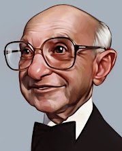
 A new digital painting I really like. I painted it with the dull green background and kept all of his values very muted then thought of the blood in the background idea, which I think works extremely well to punch it with the contrast. Sometimes my digital paintings are done on the fly, on a whim, this one was a little more planned out and I think that helped. Also, initially I wanted a solid graphic shape for the hair similar to Sebastian's Tim Burton painting that was so effective. But once I got into it I couldn't stop, I really enjoy painting hair.
I'm having this agrivating problem with the blood and the red name turning fuzzy when I publish it. The jpg is sharp, sorry. Anyway, hope you like it.

21 comments:
Great illustration David, I’ve been a major fan for about…a week. Just browsing through blogs and found yours and then it branched off to your wife’s blog, both of you are incredible artist and I’ll be passing by more often.
Cheers!
David is excellent
Hair is naturally much incredible realism, it's very good!
If you have time and want to invite you to give you a tour of my blog ..
Sorry for my bad English
un saludo !
don pablo
I like the highly designed feel of this one. His whole expression is great.
For some reason, .jpg files can't handle sharp edges on bright, saturated reds. The only way to fix it is to make your reds darker or less saturated, or save it as something other than a .jpg.
This is fantastic Dave. One of my favorites.
Amazing stuff. The blood is the perfect touch, and the hair is great too.
Awesome! I'm glad you actually painted all the hair because they look great. One of my favorite of yours too!
This is great! I love it Dave.
Wow! The Sweeney Todd,great illustration,the hair is amazing :)
neat stuff, and glad I happened upon your site. Neat too to see that digital caricaturing very often yet has this deep need to keep the tactile skills sharp in hands on painting, and your painting is quite good as well..
I've been getting an education on caricaturing from my own son...check his work out sometime if you don't mind..
http://www.jasonseilerillustration.blogspot.com/
he just did a Tim Burton using a split-comp color digital palette...
I'll have to check back...you've got some very fine work!
Larry
David thank you for stopping by my blog a taste great; have a comment yours!
thanks!!!
david muchas gracias por pasar por mi blog un gusto enorme ; tener un comentario tuyo !
,muchas gracias !
I absolutely love that green background, and the detail of the hair is superb. This is a great piece.
Whoa, this is cool man . . . love the skin tones . . . the hair is top notch too! Nice piece.
waow! Dave! easy to see you enjoyed painting hair, it's fantastic, and there is something great in the look too!
Bravo!
Wow, I love the hair, but the blood splatters are my favorite!
nice work david! I especially enjoy the shirt!!
-francis
Stunning work! The hair rendering is mind blowing!!
Awesome!!!
You are great!!!
This is perfect. Great caricature, man. The hair looks really nice.
About the blur problem. I really haven't taken stock as to what Blogger will accept, but you may want to try a PNG file format. They tend to be a little sharper as they don't loose as much when the image is shrunk for the web.... just a thought.
I was happy to have just found your blog today. This piece really struck me! That red is extremely cool (as in awesome....) and complements that green background and his pale face sooo well. And I really dig the hair. I know what you mean when you say you couldn't stop...wispy curly hair will always do that to me. I will be sure to visit often..
Post a Comment