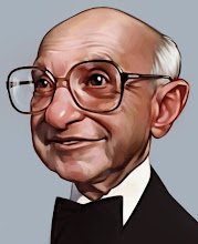
 A new paiting, I am trying to get a few good caricatures together. Ussually I try to use strong colors against a muted background to emphasize the subject, but in this case I tried to reverse that with a muted character on a vibrant background, reverse the contrast.
Thursday, January 10, 2008
Putin
 A new paiting, I am trying to get a few good caricatures together. Ussually I try to use strong colors against a muted background to emphasize the subject, but in this case I tried to reverse that with a muted character on a vibrant background, reverse the contrast.
Labels:
Digital Painting,
Illustration
Subscribe to:
Post Comments (Atom)

16 comments:
woooo ! really good caricatures, i don't really understand your background test but it's cool ! wy there are always a red nose?
Muy bueno David. I like very much.
Really good.
Antonio.
Thanks guys,
aksel, I guess I just make the noses red because noses are always a little red, and I've just decide to emphasise that feature more.
How?....How are you that good?!
I was hoping you'd do a new Putin to celebrate Time's Person of 2007! I can see him now with a party hat and a noise maker.
:))))t is very similar!:))).. Very much, was glad to find yours blog. Has received many inspiration and experience, from your masterful works. Good the technics, is to that to learn:) Especially to us нравяться the same artists.
At us a small planet:))))) Rostov perfectly!:) I live here only years, before I was the militarian in the North. I the self-educated person, and never anywhere did not study to draw, it was not possible. But here such blogs as yours very much to me help. And as works of masters. I admirer Norman Rockwell, Scott Gustafson, Paul Calle and as many those who is listed at you in great blog Links Thanks that show as draw, I shall repeat, your works charge me energy:)
That's a great Putin David. I agree, the contrast is very nice!
Nice one, so much that you now should be careful about russian spies..:D
You make me day Dave!:oD
This is genius! Forget Putin, YOU are the man of the year.
Great work David! Sounds silly but I really like the red glow in the ears - accurate for the lighting and a nice touch! You are an inspiration!
Great stuff... there's an added element of creepiness to this one. Don't know if it's because ofthe BG colour. Butthere issomethingto this one.
wouw! very cool! congratulations! and good luck in yours jobs!
Excellent as usual Dave (the two previous posts are excellent too!)
you did him perfectly, and the character takes all my attention, no matter what could have been placed in the background.
congratulations again!
FANTÁSTICO.
BRAVO!!!!
Abçs
Post a Comment