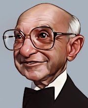
A painting in progress for the Avalanche blog
Thursday, May 28, 2009

Tuesday, May 26, 2009
Whitman

I got a great project for the most last issue of The Weekly Standard. It's Meg Whitman, I was happy with the work on the face I like the sculpted feel, but the body is pretty stale IMO, sigh.
Monday, May 18, 2009
Friday's figure drawing
 Usually on Friday's I find time for a figure drawing session. Here is this weeks contribution. I think another half hour of refining could have made it pretty good. I would guess this is more like 1.5 hours.
Wednesday, May 06, 2009

Tuesday, April 28, 2009
figure #29
 Finally a live figure drawing done in my sketchbook that is a little more consistent with my regular drawing style. It has a much more polished look.
I would guess the structure is done in about 15 minutes the 20 minutes on the face and about 45 minutes on the hair. Total about an hour and a half.
Thursday, April 23, 2009
Taft again

I'm sorry for my absence. Too many competing priorities.
I wasn't satisfied with Taft's shape but this is better.
"What's your favorite dinosaur?"
"Velociraptor!" "Velociraptor!"
"Did we just become best friends?"
Tuesday, April 07, 2009
Ice
 After a long absence, a digital painting is ready to make an appearance. Don't read anything into the meaning because there is none, just done for the sake of an interesting narrative.
I've been a big fan of Thomas Fluharty's digital work. He doesn't try to hide the digital feel to it and there is an appealing mix of hard and soft edges. It's like a digital version of "painterly". This painting has a little of that with a more unfinished feel around the edges.
Wednesday, April 01, 2009
figure #28

A recent figure drawing. This model obviously didn't feel the need to comb his hair for this session.
I think my drawings from life have a different indefinable quality to them then those done from photos. Maybe less refined but more natural? I don't know.
Sunday, March 29, 2009
5 minutes 2 hands
 I was finally able to pull my hands away for from their occupier for 5 minutes and do a drawing. You'll notice this is less detailed then usual, that is because the lights were dimmed to let the baby sleep but it does help to change my focus from details to more general shapes, values, etc.
Monday, March 23, 2009
figure portrait
 A couple weeks I did this portrait at our weekly figure drawing session. I only had my sketchbook and it is very tricky to do a full figure with my usual .3 size lead mechanical pencil so I typically do a portrait. It is less free then most drawings because I worry more about the measurements on these.
Excuse the image, I gave him the drawing and only had this poor quality digital image left. I've decided my policy is only to give away a drawing if they really really act like they want it and go to the trouble of asking. I'm usually pretty willing but a) I feel very presumptuous offering ("I am so sure you want this fantastic drawing I did, right?") and b) I am not sure how much they want it, I would usually prefer to keep it. He asked about getting a copy but when he got the original seemed less then ecstatic.
Wednesday, March 18, 2009
sketchbook #36

A small drawing. This face is pretty small so when working with limited space you have to make sure each line placed correctly.
Monday, March 16, 2009
This is not a painting
 Well, things got more complicated last week with the birth of our first daughter. Actually she is (obviously) beautiful, but a handful that didn't come with an off switch, so I will have to work harder to find time for my artwork. She will surely be a good muse as she grows and her artist mother and I are already teaching her the basics of color theory, composition using the Golden mean, chiaroscuro, fat over lean, etc. She will be an uber-artist.
Monday, March 09, 2009
Glow
 A new oil painting done on a 16"x20" Masonite board. I basically like it. One interesting thing is that as it has been sitting against the wall for the last few weeks I've notice that it has a fantastic glow to the face (this isn't really relayed by the digital image), which is what I had hoped for. The dull cool colors in the background and warm colors in the face to direct the attention. I think the face has 3-4 layers to build up the lights so I suppose it is reflecting light just below the surface.
I've included a detail so that you can see the paint work up close.

Wednesday, March 04, 2009
Ode to Ingres
 I LOVE Ingres. His paintings are so fantastic. Above is a drawing I found in a great book called Portraits of Ingres, I highly recommend it. This is based off one of his drawings, not necessarily a perfect match but I thought is was interesting how carefully he would do the face then a lot of the periphery is done very rough. Some of the hands, like this one, look like their straight out of a Picasso drawing.
Tuesday, March 03, 2009
Painting final
 So here is the final version of the painting. This step is just the fleshing out and final detail. Obviously this is rougher than my usual style but I've done that purposely. The initial and rough work is done with bristle brushes and the more finished work is sometimes sable but usually Langnickel Royal Sable which I really like at the moment. The Sable and hog bristle are from an online company called Trekell, who have great prices.
I'll probably have this propped up against the wall in my studio for a couple months to see if it feels okay or I may have to go back to it.
You can see each step in the process here.
Thursday, February 26, 2009
now in Digital HD color
 And just in time for the governments scheduled conversion to digital! The textured version of the below model.
Sorry to visitors that are not interested in 3D modeling.
Tuesday, February 24, 2009
Sculpted Royalty
 I was hoping to post a new oil painting but here is a sculpture based off of a painting I did a little while back, which you can find here. I would love to do a sculpture in clay and actually bronze the thing. This one would be nice to have on my desk.
This was all done in ZBrush, again thanks to Danny Williams for his mentoring.

Thursday, February 19, 2009
sketchbook #34

I found this picture of Caroline Kennedy as a child, I guess I am too young to know how cute she was as a child. Very interesting eyes.
One, in my opinion very important, art tip is learning how to throw away what you've done and being confident that you can do it again. A lot of artists are way too hesitant to start over if they think something is pretty good already but maybe one portion is off. Don't be afraid to erase it and start over. These drawings are usually the second or third attempt, consider it as 3x the practice.
Monday, February 16, 2009
sketchbook #33

Today's drawing.
I've been breaking my cardinal rule lately which requires me to draw constantly. Luckily today I did. Don't worry this drawing is not a jerk I saw on the street, he is a jerk that I saw in a catalog. While drawing from photos, especially not my own, is not preferable to life it does give me a nearly endless supply of good subjects that don't take breaks.
Wednesday, February 11, 2009
3D model - Pirate
 I did this model while experimenting in Mudbox. It was modeled in a flat gray but I wanted to see what it would look like colored and got a little carried away. So this is a full painting done entirely in overlays over the rendering. He definitely looks like a pirate so I was inspired to give him tattoos, the mother one is cool but you can't leave him without a Koi fish. I'm sure all pirates had at least one Koi fish tattoo, it was practically a ticket onto the boat.
Actually, I was initially trying to just learn by copying a brilliant model done by Daniel Williams (the first in his gallery). But as it developed I could tell I was failing and going way to realistic. You can see some similarities if you look closely.
Sunday, February 08, 2009
Painting painting - step #4
 So here is more of the meat of the painting after a day or two of drying time. Again kind of a rougher process then usual but I've enjoyed the more straight forward approach. Similar to my drawing style the face is were I like working, I like the challenge, and the background is more of an afterthought. That's why with this of any other painting the face is done first.
I've laid down an extremely thin layer of walnut oil (non-alkyd) to give the feeling of painting wet on wet but without the messy mixing colors. The colors and draftsmanship are being tightened up at this point. And I am building up the lights, one thing I really like about painting in layers to build the hi-lights over 3-4 stages because it gets a really nice glow especially in good light. I've pushed the sky toward blue but wasn't comfortable with it so it will change.
My mind is muddled so if you have any specific questions come to mind please ask. More to come.
Also note, the step #3 image is awful, this is much better.
Wednesday, February 04, 2009
Pomposity
 I found this cool picture of an art critic, started a painting a while back then never really got back to finish but the face is nice.
Sunday, February 01, 2009
Base painting - step #3
Don't worry it gets better.
 So this is step #3 in this painting. If I remember correctly I was in a hurry to get painting so a rushed value under drawing, a quick spray fix, wait 5 minutes and time to paint. I slapped on a burnt umber thin layer with turpentine to thin and painted into it with no medium except more turpentine if needed. That explains the dark colors because anything you paint picks up about as much Burnt Umber as it adds new color. I used a lot of quick loose strokes to get the face and was very proud of it when I was done, only to return the next day to be disappointed (was obviously staring at it too long). I did like the way the brush work looked but not the details of the drawing, no matter there are more steps to come.
Excuse the blown out light values, I'm also still learning to use a camera effectively.
 So this is step #3 in this painting. If I remember correctly I was in a hurry to get painting so a rushed value under drawing, a quick spray fix, wait 5 minutes and time to paint. I slapped on a burnt umber thin layer with turpentine to thin and painted into it with no medium except more turpentine if needed. That explains the dark colors because anything you paint picks up about as much Burnt Umber as it adds new color. I used a lot of quick loose strokes to get the face and was very proud of it when I was done, only to return the next day to be disappointed (was obviously staring at it too long). I did like the way the brush work looked but not the details of the drawing, no matter there are more steps to come.
Excuse the blown out light values, I'm also still learning to use a camera effectively.
Wednesday, January 28, 2009
Upcoming show

Good news about on the gallery front, I've got an upcoming show at the Legacy Gallery in Scottsdale, Arizona on February 19th.
I'm excited to get my work out there and see how it does in the real world. I got a feature in this months American Art Collector which is a very nice magazine. I'm a little uncomfortable with my comments, it's like watching yourself on tape, my own direct quotes always sound bad to me.
Wednesday, January 21, 2009
Underdrawing - step #2
 Step one was the original drawing.
I said in the drawing stage that I would post pictures along the process, but that is a lot of pressure that demands a competent painting. I admit I held off until I could see I would be more or less satisfied withe the result. Another problem with posting my process is that I don't have a set process it changes a lot as I learn. Unfortunately oil painting is only a side job and I don't have enough experience to have a set method.
So here is the underdrawing. It is a new method that I haven't used before but I do like, quick linework then a lot of really loose charcoal scrubbed around with the back of my hand to get a simple value study.
Stay tuned...
Monday, January 19, 2009
Pennsylvania field
 A landscape, obviously.
I feel landscapes are my weakest point. I naturally am inclined to do artwork of something like people, because it is so difficult and makes me work to capture it accurately. I think I have more of an analytical mind that makes landscapes that are so random extremely difficult for me to reproduce. This is maybe the first I've ever done that I have been mildly satisfied with, we'll see if that holds up.
Also notice the black and white painting two posts down has been updated with a better representative image. The old image was taken too close which gave me kind of a wall-eye view that I tried to warp back into place but I noticed some subtle but annoying distortions in the face. You may not notice a difference but it is better, trust me.
Thursday, January 15, 2009
On a lighter note
 I love politicians and Nancy Pelosi is always one of the favorites (read sarcasm).
I was worried that I may have lost any caricature ability with lack of practice, but this one turned out. Although I may not like it by tomorrow. this is my typical .3 size drafting pencil in my sketchbook.
Aside-that lighter note is probably more of a tragic note when they steal my hard earned money.
Tuesday, January 13, 2009
Flowers running off the edge-updated
 Finally an oil painting. I felt like getting back to my roots with a black and white painting which is a very useful exercise to work on brush strokes, values, technique, composition, etc. All those elements that need to be worked on but get lost when you throw in the 300 pound gorilla called color.
I'm not sure I am completely happy with it. Let me know what you think of the composition I think the flowered branches running off the edge are kind of intriguing. Also, once it is shrunk down as a digital image it looks more photographic then I hope the painting does. Hopefully the brushwork makes it more of a painting though I should push it enough to show in this format.
Thursday, January 08, 2009
Done?
 The full color version of the aforementioned Christ statue in Prague. I was trying a new digital technique that I think I like. I work at it until it's looking pretty good then I use a filter to blur the entire thing. This keeps my structure but looses a lot of the ugly lines so I can go back into it cleaning edges and linework. I also used this on the drawing exercise below.
Also, thanks to the talented Varvara Harmon for tagging my blog.
Sunday, January 04, 2009

Subscribe to:
Posts (Atom)