Showing posts with label Digital Painting process. Show all posts

Thursday, August 20, 2015

Cosmonaut


The latest illustration has a little different style. I've been pushing to let my line work stand out more. I had a feeling the fully rendered style I have been using had a really overworked feeling to it. I think the lines keep it more fresh and overall it is faster. Below you can see a lineup showing the steps to get there. First a rough with pencil and paper, then i move to digital making that really light and tracing over it while adding a rough digital drawing fleshing out much of the detail. Then a second pass again tracing the last but with clean finish lines, then the color work.


Monday, August 03, 2015

Searcher

Thanks very much to the kind comments from the stalwarts still sticking it out in the Blogger world. 


I wanted to work on getting my style a little less overworked. I also wanted to keep the line work. Here is the product, hopefully I can keep developing the look but I was really pleased with the final image, enough that I may further develop the character and story.

Tuesday, August 19, 2014

Tone painting video


A tone painting of a drawing of mine. This is about a half hour compressed down to a couple minutes. I've been trying to post a couple videos of things people want like the finish shading on a drawing and current color method for digital painting but they're still not working out so maybe this will be of interest while you continue to wait. Sorry.

I put the drawing on it's own layer set to multiply, on the base layer I use the paint bucket to apply this greenish brown tone. Then on a layer in between those two I do my painting.
Always follow the general to specific rule. I start out with broad brush strokes defining the overall values then work down to more specifics. First adding darks and when those are getting close I add some lights. Most of the painting is done with the base tone, a 70% dark value then a 30% light value. Only toward the end I will start to use the colors within this range. And at the very end, real bright and darks values to pop specific limited spots.

Hope that helps.

Tuesday, January 21, 2014

Netanyahu

A painting done last week for The Weekly Standard. I got nearly 2 days on this a whole day more then typical. So although it was a quick turnaround I had a little more time to simmer with it, a slightly less frantic pace gave me a chance to stick with the drawing longer and be more methodical. I felt like the rendering turned out much better. For your enjoyment I've included an animation below of the steps. The great art director over there requested up a sized up beard which was the right call of course and improved the feel but I wish I had thought of this earlier to incorporate it better into the piece. It's funny how you get your head down in the work and you don't see things that should be obvious but are not because you aren't looking for them.


Monday, August 06, 2012

Bernini


Another in my installment of digital paintings of great sculptures. This is a Bernini in the National Gallery. It is a great way to practice drawing and form painting with it's subtle lighting shifts. I wanted to finish this but I also think it's nice to leave it rough around the edges.

Below I've got a 3 step gif with my process in a nutshell; a drawing stage, the drawing with basic color underneath, and the flattened image being detailed out.


Thursday, September 29, 2011

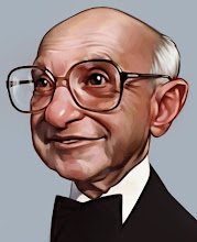
the new me

My previous avatar has lost favor in my eyes (not that I had any particular favor for him other then his interesting face). So I have decided to move on. This time I chose someone I actually like, Mr. Milton Friedman who also has a cool face. Unfortunately it doesn't size down too well and looks noisy in its small form.*shrug* I have had questions in the past assuming I am an older gentleman which I am not, yet. But my face is not nearly as interesting.
I was thinking about how I would like to do a more complete picture instead of a simple portrait so I may build a story around this face. Stay tuned.

Bonus:
I had enough saved out files that I put together this handy animated gif for your viewing pleasure. You will notice that a lot of the drawing is done at the painting stage. I try to get as close as possible with the drawing and nail the general parameters but I really kind of sculpt it at the painting stages.

Photobucket

Thursday, December 03, 2009

Painting the classics


At last, here is the process painting done by starting with this drawing and resulting in this painting. It is extremely jumpy because this is a 3 hour painting reduced down to 2 minutes. I also constantly rotate the painting about 60 degrees to judge it(as you can see in the preview), instead of stepping back.

Here's a quick list of the steps:
  • 0:05 - initial drawing lifted to its own layer base color put behind it and then paint some flat colors into the areas.
  • 0:10 - shadows added on a multiply layer.
  • 0:20 - lighting added in screen layer.
  • 0:25 - general coloring done with soft light layer.
  • 0:30 - direct painting on a normal layer.
  • 0:43 - multiplied green layer added, all the layers were flattened then I blurred the whole thing. This is a new trick I am a big fan of currently.
  • 0:45 - back to more direct painting to reestablish my edges and refine all on the flattened painting.
  • 1:45 - At this point the rendering is basically done so I go through a long process of finish work experimenting with different gradients, glowing, overlays, lighting, etc. until it feels about right (note: it never feels totally right).
Painted in Corel Painter, mostly using the 2b pencil tool, a little digital felt tip pen. Hopefully it helps, let me know if you have questions and I'll do my best to help.

Tuesday, December 01, 2009

Color

The color version of the below post. You'll notice the shapes have changed a bit. A new trick I like to use is distorting the drawing in Photoshop before I get into the painting. Often I feel like my drawings are pretty static, the distortion can push it and make the shapes more interesting. While I was painting I thought of a superb little economics lesson by Milton Friedman about a pencil, so I decided to focus his eyes on that.

I plan to get that video up this week. I'll probably say a couple more things about my process in the next post.

Monday, November 23, 2009

More trading

A new sketch to be traded away.

This has led to a color version and even a process video to be posted soon.

Tuesday, December 11, 2007

Brushes

I have been fielding a lot of questions about the brushes I use so I thought I would just post it so I could refer people here in the future. (These are in Corel Painter)
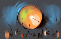

This picture is a nearly comprehensive list of the brushes that I use in order of their frequency:

1-This is a custom brush made by the great Ryan Wood(you can probably make something similar using a round oil pastel brush and adjusting in the brush editor). It is really basic, I like that it picks up some of the underlying color and is a solid stroke.

2-The felt tip pen, I use this brush for nearly all line work and sometimes to darken areas. As I begin to lose the structure of a painting I use the hard felt lines to reestablish those interesting shapes.(example)

3-2B-pencil, very useful basic soft edge, all-purpose tool. I can soften edges, do linework, and fix blending areas.(example)

4-Digital airbrush, similar to 2B but it creates kind of a diffusion with random colors, sometimes I want the color variation,usually just on the underpainting.

5-Smeary wet sponge 160, sometimes a cool tool for grainy edges and building up color.(example)

6-F-X Glow brush sometimes useful for lighting up an area or adding highlights, I rarely use it.

I am really not a tool or software guy. I usually just find something that works and stick with it, that is why my oil painting brushes are so trashed. But hopefully this helps any interested in the brushes that I use. Questions?

Tuesday, October 16, 2007

Underdrawing

For lack of anything better, I thought I would post an underdrawing for a in-progress painting. I did this yesterday in about 30 minutes. Through practice I am able to really leave out all the unnecessary lines and really focus just on the important lines and shapes that will give me the information I need for the painting.

Stay tuned for the progression.

Sunday, October 14, 2007

step 2

Here is the second step in the progression of my painting(see first step here). Basically the drawing has been set to it's own layer and the general colors are built underneath. At this point I drop the drawing and start into it, you can see where I've started under the eyes. I don't really use layers until the end as a tool to adjust saturation and darks and lights, similar to a wash layer in oil painting. The colors are pretty grey but I work that out as I go.

I thought I would go with a bright yellow background to see if I could make it work. I've always wanted to use yellow like this beautiful N.C. Wyeth pirate painting.

Friday, October 12, 2007

step 3

The third step is on a flattened image, I just start to flesh the thing out trying to introduce as much color variation as possible. Most of it is just done by picking a color and putting it down, but a little of it is blending and reestablish lines that have been lost. With the foundation I have from step 2 I can push the colors and and shapes to add interest.
I work in Corel Painter, this step probably took a little less than a couple of hours.

Wednesday, October 10, 2007

finish


Here is the final step with it's finish piece. I guess it loses the impact seeing all of the steps leading up to this finish, but I like the background texture. This was finished with just a few layers set to different opacity's to add color and atmosphere. It feel like it needs some text in the negative space(don't worry I wont add any).
I almost forgot, props to Joe Olsen for his brilliant drawings used subliminally as background noise.