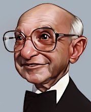
Found myself a toned sketchbook last week. I love the ability to work in both directions, darker and lighter, since I don't think I use a good range of the one. I all of the sudden feel like I am working on a piece for a museum, just feels nicer in the end(until you run a figures head off the page of course).
I'm copying the great J.C. Leyendecker of course.
Monday, March 25, 2013
Subscribe to:
Post Comments (Atom)


7 comments:
Very nice work. I like working on toned paper too.
I've recently started checking out more Leyendecker and they're amazing. Right up there with Rockwell. I love your line work as well though Dave, especially the last couple Weekly Standards! GREAT STUFF!!!
i want to be soldier :*(
i recently tried to also use some chalk in my sketches, cause i use a non-white sketchbook too.
im no master craftsman, but the drawings do come to life somewhat more that way.
id be super glad if you could give me some pointers to improve my drawings...
http://www.sycra.net/forum/download/file.php?id=7649
http://www.sycra.net/forum/download/file.php?id=7885
erik
Yes those look great! They are really solid, I get a lot of these type of questions and these are among the best I've seen.
So a couple things come to mind. First the values I feel like you've got 3 kind of separated layers. A white, the paper, and the pencil. I think you should work on trying to get a smooth continuation of the values. Probably my April 8, 2013 post is a better example then this one. Try to imagine it in 3d space instead of a 2d being transferred to another 2d. this should help round out the shading.
Second, I would say try to start with the most general shapes(whole head), then get more detailed(eyes, mouth) then even more detailed(highlights in the eyes, specific shading). Measure it out a before you get to the details make it look almost like a Iron Man helmet to make sure you are placing features correctly because when I look at them I feel like some of the proportions drift a bit, little things like the eyes not quite lining up.
Hope that helps. It really is good, I think just more time will be what you need to be able to see more and more.
David
im not sure you are replying to my post - since it doesnt show up on here for some reason - but if you do, thanks a lot! im still struggling a bit with how to work the chalk - it brushes off of the paper way too easily and even fixative eats up most of it. gotta find a better white option. definitely true about more proper approach, thanks! will go on...
erik
Yes, that was for you.
I have been using a white Prisma color colored pencil that works pretty well and does not get lost like chalk will.
Good Luck
Post a Comment