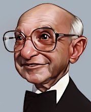
 So here is more of the meat of the painting after a day or two of drying time. Again kind of a rougher process then usual but I've enjoyed the more straight forward approach. Similar to my drawing style the face is were I like working, I like the challenge, and the background is more of an afterthought. That's why with this of any other painting the face is done first.
I've laid down an extremely thin layer of walnut oil (non-alkyd) to give the feeling of painting wet on wet but without the messy mixing colors. The colors and draftsmanship are being tightened up at this point. And I am building up the lights, one thing I really like about painting in layers to build the hi-lights over 3-4 stages because it gets a really nice glow especially in good light. I've pushed the sky toward blue but wasn't comfortable with it so it will change.
My mind is muddled so if you have any specific questions come to mind please ask. More to come.
Also note, the step #3 image is awful, this is much better.
11 comments:
I actually like the blue sky. When I look at this image, I see a boy walking away from familiarity. Perhaps running away from home. I see the blue sky as the kind colours of home just visible in the distance. Maybe I'm reading too much into it, but that's what I see :)
Beautiful image anyway!
you complain about the third image, but I gotta say #3 was beautiful. I really love paintings at this stage - they're starting to be fleshed out but they're still loose and ethereal looking. great stuff, thanks so much for posting this tutorial, im trying to learn how to paint and its a great resource.
Thanks,
Andy-Interesting, I hadn't considered that.
Agent, I'm complaining particularly about the blown out whites in the photo image here not so much the state of the painting itself. Thank you.
Always learn a ton when I come here. I love seeing your process Dave. I just posted a new porfolio Blog by the way. You should stop by!www.lubbersportfolio.blogspot.com
See ya
Dave, I love this. I think you are a brilliant illustrator, no doubt, but my heart is in your paintings. Your illustration is wildly entertaining, your painting soulful, genuine, warm, dimensional, and quite deep. I think if I were an illustrator/artist such as yourself, who does both so wonderfully, I would struggle heavily within myself between the two. What came first, the chicken or the egg, perhaps in your case, both. Blessings.
Painting is great...great job! :)
Excellent job, this is a great painting!
incrível!!
Admiro teus trabalhos, são magnificos!!
-------------------------------------
incredible paint, congratulations
please, visit my blog, look my job! and if possible, post a comment
(Sorry, my "terrible" english) ;D
This is looking really good David, it's great seeing and reading your process!
Hi David,
Composition is very nice. I love the color patches on his face. One thing... his coat and T-shirt's color are same, it will be better if you choose some other color for his T- shirt.
Wonderfull, love your work!. I like this painting just as it is! Great!
Post a Comment