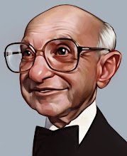
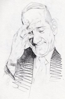
 A new drawing. Often in my sketchbook I will just find an interesting face to draw and really go into detail with it. Then I just slap on a more simple graphic body to complete the picture. In this one I also did a more detailed hand, I think it ties things together a little to have the major points done in detail. I really went into a lot of detail in some really subtle parts on the face, thats maybe why I like the .3 lead I can really do tiny light details.
Tuesday, December 26, 2006
Sketchbook #7
 A new drawing. Often in my sketchbook I will just find an interesting face to draw and really go into detail with it. Then I just slap on a more simple graphic body to complete the picture. In this one I also did a more detailed hand, I think it ties things together a little to have the major points done in detail. I really went into a lot of detail in some really subtle parts on the face, thats maybe why I like the .3 lead I can really do tiny light details.
Labels:
Drawing
Monday, December 18, 2006
Kaitlyn
 A new painting. I hope the black and white isn't getting too tedious, I have some color paintings on the way. I really like how this one turned out, but I don't think it will ever translate into the digital format though.
It is oil on board, 16" x 20". I usually go one basic pass to put down all of the basic drawing work, it has very soft edges and not much detail.
 Then it takes 3 or 4 passes to slowly tighten up all of the edges and details. I would like to do looser work, I plan on going that direction, but a lot of times I just get stuck trying to make it as perfect and beautiful as possible.
Oh well, It's nice enough that I'll make it my new website welcome picture.
Labels:
Oil Painting
Thursday, December 14, 2006
Shooter

A new digital painting. I don't really know the reasoning behind it. I sometimes just start drawing then go whatever direction hits me first. To save me the trouble of a real background I just scrub in some colors that will accentuate the primary characters design. Done in painter, like pretty much all of my digital work.
Labels:
Digital Painting,
Illustration
Sunday, December 10, 2006
New project
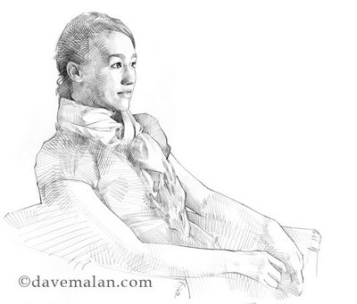 Here I have my drawing for a new painting I will be working on. I usually try to do my painting from a transferred drawing. It is a convenient way to work. You can work out all of the drawing problems, composition, perspective, sizing, before you are stuck into the painting work. I think this is headed into a good direction, so we'll see where it ends up.
Labels:
Drawing
Wednesday, December 06, 2006
This is not a co-worker
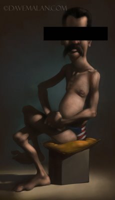
A quickly done painting that isn't quite satisfying but I don't want to spend the time to figure out why. This is not a co-worker. Any resemblance is purely coincidental, the person depicted does not exist.
Labels:
Digital Painting,
Illustration
Thursday, November 30, 2006
Oil painting experimentation

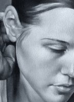 A new painting I have been working on. Oil on masonite board, with quite a bit more texture than I usually work with( you can see the texture in the detail image at left). I am going to try something crazy with this painting and paint the colors over it. My past black and white paintings had the same intentions initially, but they turned out too nice to paint over. I think the added work figuring out the values and brushwork before the colors, should cut the things I need to worry about in half, right? Stay tuned to see if it works out, I should have a color version soon.
Also, I have made a few minor changes but if you haven't looked through my lists of Great artists and Great living artists you should. If you like my work, you will find similar but much better work with these links, and maybe a few you haven't yet seen.
Labels:
Oil Painting
Sunday, November 26, 2006
Sketchbook #6
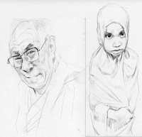
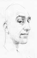
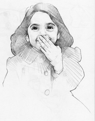 I work almost exclusively in pencil with a .03 size mechanical pencil. I have no real reason except for that I have become accustomed to it. There are some really nice things like the tight clean lines and I don't need to sharpen. but it makes it a little difficult to shade large areas, thus the trailing off crosshatching as I lose patience. Cross hatching is an interesting thing, I always wanted loose spontaneous lines, I worked at it till one day in high school they just became spontaneous.
Labels:
Drawing
Tuesday, November 21, 2006
Wednesday, November 15, 2006
Cast painting

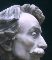 Finally a finished version of the statue painting I did. It's about time I put up a post of some classical non-digital art. It was fun and challenging to paint, especially around the face with all of it's detail and subtle color changes. I am still learning how to take good photographs of my work, this doesn't really do it justice I assure you. The background is a flat color but it all catches the light different to produce this lovely ocean wave background, maybe it's a happy accident. Whatever, just don't click on them because they look pretty good as small icons.
Labels:
Oil Painting
Friday, November 10, 2006
Shoreline
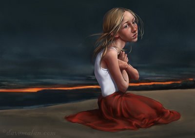 Here's a new digital painting. I like how the face turned out, but backgrounds always bring me down. I just don't have the patience for the detail and have a hard time suggesting things with simple strokes. I really think I need to put more time into the concept. I usually go with whatever comes to me as I am working. I thought this was a good idea with the orange line, but maybe that confuses the light source, the moon maybe? Hope you like it.
And, drop by my website. I've added some detail images if you click on paintings.
Labels:
Digital Painting,
Illustration
Monday, November 06, 2006
Vote for your favorite


I thought since it is election season in America, I would hold my own official vote. Don't worry this computer voting system is completely save. Here are two Warren Buffet caricatures. Please vote on which version you like more. I think the one with all the bells and whistles is leading by a large margin in the exit polls but this is a democratic poll. The winner will control my digital painting folder and keep immunity at the tribal council.
Labels:
Digital Painting,
Illustration
Thursday, November 02, 2006
Painting practice

I guess this is maybe a post more appropriate before Halloween, oh well. This is a nice picture I found somewhere and decided to paint. I hate it when I paint things like this just for practice and they turn out nice(in my opinion), then I am stuck with a painting that's not really my own. Practice, I guess.
I included a detail picture. I've had a hard time getting good pictures of the detail in my paintings. Digital pictures will never do justice to the real thing.
 Practice, I guess.
I included a detail picture. I've had a hard time getting good pictures of the detail in my paintings. Digital pictures will never do justice to the real thing.
Labels:
Oil Painting
Monday, October 30, 2006
Davemalan.com
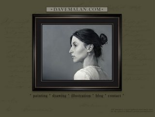 I have just finished a redesign of my website with some newer art but especially a new design. I would like your input on the changes, especially if you are familiar with the old site. Also, I've heard rumors of it not working for some on Macs, but my it works on my Mac, so if you have problems please tell me. Visit it here
Thursday, October 26, 2006
Sketchbook #3
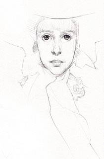
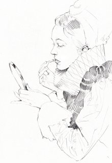
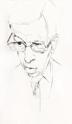 Some more sketchbook work a couple from tonight, one is a Rockwell study. I like drawing more than anything. I like the sketching style that has evolved for me over years of practice. I have pretty much ditched all of the non-essential details and just focus on the important parts of the subject. I also usually just suggest the darks with a quick hatch scribbling, another thing that just started looking better after a lot of practice.
And "Thanks" to Ryan Wood, my last visitor(see lone comment on "drawing" post).
Labels:
Drawing
Wednesday, October 25, 2006
Drawing
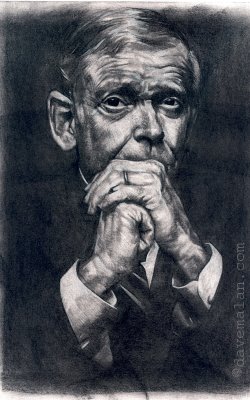 Here is a recent drawing done in conte I think, maybe nupastel, I forget. It is in my sketchbook I like the full range of values I get but it makes a mess.
I was profiled by Lines&Colors yesterday, if you've never been there it's a great blog featuring a new artist everyday. It is a useful resource for artists that you may not know about. Thanks for all the comments.
Labels:
Drawing
Friday, October 20, 2006
Halloween
 Here is my Halloween submission for the Avalanche blog. It is great to have such a talented place to work because it really pushes me. I think this painting turned out very nice.
Prints Available
Because I have a few nice paintings around I have decided to offer a couple of them as prints, including this Halloween painting. They are inexpensive. Right now there are 3, there may be more in the future. Please have a look here.
Labels:
Digital Painting,
Illustration
Monday, October 16, 2006
Gallery work

I've got a couple of paintings currently in the Realism Invitational at the Klaudia Marr Gallery. This one is a detail of probably my favorite painting to date. It's actually my little sister done in Oil on board, 12x16.
Labels:
Oil Painting
Thursday, October 12, 2006
Royalty

A painting for Avalanche of a king. I like how the colors worked out. I was nervous about the drawing early on, but it worked too. I am really trying to give my paintings more depth and more complexity.
Labels:
Digital Painting,
Illustration
Tuesday, October 10, 2006
Statues
 I love going to fine art museums and looking at the classical statues. I think sculpture is maybe a more forgiving medium because nearly all the sculptures are so beautiful (though not all the paintings always are). This is an absolutely brilliant statue in the New York Museum of Art called "Ugolino and his sons" by Jean-Baptiste Carpeaux. I also love the fact that there is an intriguing story that you want to know after you see the sculpture. This is a pencil sketch from my sketchbook.
Labels:
Drawing
Friday, October 06, 2006
The Godfather
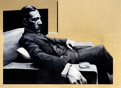 Nobody likes Gilligan anymore so here is something a little darker. The Godfather slightly stylized oil on board painting. This is an older work, but oil painting with black and white is always a good way to learn how to paint without the headache of colors. And The Godfather I and II are great movies.
Labels:
Oil Painting
Monday, October 02, 2006
Cafe

This is an oil painting done a short while back. I had some nice reference I took sitting at a restaurant that was really deep red everywhere. So I tried to do a play off the golden age illustrator Coles Phillips(thanks Kactiguy) and his dissapearing edges. It is an oil painting about 16"x20".
Labels:
Oil Painting
Monday, September 25, 2006
Composer
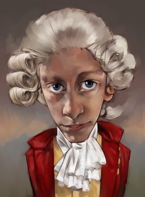 just another painting of another face with some crazy hair and costume. I didn't really want to put in the time for the finish work so here it is.
Labels:
Digital Painting,
Illustration
Monday, September 18, 2006
Pilgrimage
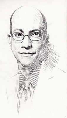 I made my first pilgrimage to Walt Disney World last week, that place is unbelievably cool. The Animal Kingdom was so impressive artistically, they do such a great job making cool environments. I was happy to see new visitors when I returned, thanks for all the comments. I haven't had time to work, but here are some newer drawings. I like lost lines. The second is easily identifiable (see The Godfather II, the best movie ever).
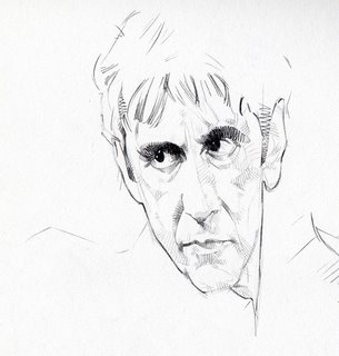
Labels:
Drawing
Friday, September 08, 2006
Brompton oratory
 This is a recent oil painting. It's about 18"x24". I was excited by the idea but once I started into all that architectural detail I changed my mind. But all the work turned out well. I don't think the face is really that red, but I like the composition. The setting is this really great hidden cathedral in London called the Brompton oratory, which is just filled to the brim with gaudy details, I dig gaudy details(unless I am painting them).
Labels:
Oil Painting
Monday, September 04, 2006
Putin
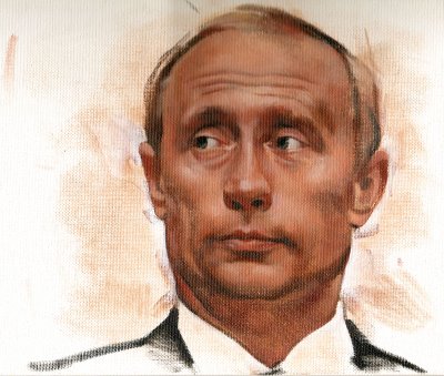 Here is the Russian president Putin painted as practice. A little too red in my opinion. One thing I hate is canvas. It always drives me crazy because I cant control the paint like I would like with all that cloth texture. If it is really a tight weave I can handle it but I always prefer masonite board with a touch of texture from the gesso. I thought it was about time to post an oil painting.
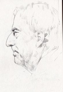
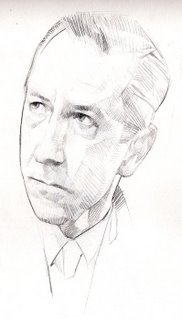
Then a couple drawings the one is not Karr, the Ramsey nutcase. It's actually the guy from "Good night and good luck"(a really lame movie with a lame premise.
Labels:
Drawing,
Oil Painting
Thursday, August 31, 2006
Rocket man
 I did this a couple of months ago. I think it was my first good color painting. I liked how the colors in the face turned out. I did the light burst just now, I thought it might be fun. He had the hard light on his face so I thought it was probably missing a little light on that side of the picture.
Labels:
Digital Painting,
Illustration
Tuesday, August 29, 2006
Frustrated
 This is one of the drawings from below all painted up a little looser than I would normally. Hopefully it works. Judging by the purple tie I think he may be in the asian mafia, I think they wear purple ties?
Actually I used no color reference for this so I am pleasantly surprised with the outcome. I think sometimes my color is a weakness.
Labels:
Digital Painting,
Illustration
Sunday, August 27, 2006
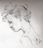
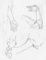
Sketchbook #2
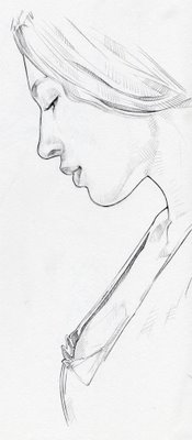
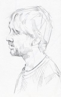
A few more from my sketchbook, my bread and butter. You might notice one drawing is the hobbit on "Lost"(no, I don't watch "Lost", sorry).
Labels:
Drawing
Tuesday, August 22, 2006
My favorite artists
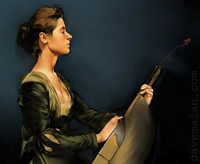 I wanted to get out a list of the great painters of all time along with my previous list of living greats.
Alphonse Mucha, probably my favorite artist ever. He is famous for his graphic work but I think the brilliant stuff is his oil painting which are more difficult to find. See The apotheosis of the Slavs
William Bouguereau, unbelievable figures with perfect realistic skin. If you haven't seen one of these in real life you need to.
Nikolai Fechin, genius drawings you won't believe, probably the best I have ever seen. I don't feel it with his paintings though.
Emile Frient, really beautiful, I love his style and feeling.
Jean Leon Gerome, why is it so hard to find one of the greatest painters ever? See Pollice Verso.
Lawrence Alma-Tadema.
John William Waterhouse.
John William Godward, stunning paintings. Nice figures, cloth, marble, etc.
Ingres, so great.
Sir George Clausen, he must be my favorite style. I am just paralyzed when I see his paintings in a museum(see Day Dreams in Philadelphia).
Logsdale, you must be kidding me. Some of the most complicated intricate work I have ever seen.
Daniel Ridgeway Knight, I love beautiful people in beautiful landscapes. A few look a little too much like a Kinkaid painting(that's a bad thing) but a couple are absolutely brilliant. See one here.
Thomas Dewing, there is a whole building of Dewing in D.C. and a great painting in the national gallery(The painting above).
Lepage.
La Thangue, hard to find.
Frederick Lord Leighton,
Charles Sprague Pearce,hard to find.
Almost missed John Singer Sargent. Brilliant portrait artist. Painted with such simple strokes.
Illustrators:
Maxfield Parrish, no one can paint colors like Parrish, need to be seen in real life. I like his characters but the landscapes are crazy good.
Norman Rockwell.
Don't forget J.C. Leyendecker (or here and here). Stunning complicated whimsical work. Rockwell's favorite(I think) and my own.
Robert McGuiness, good illustrations, great cowboy paintings. Make sure to see the western work especially his landscapes. Oops, I think he's still alive.
N.C. Wyeth.
Dean Cornwell. Another early great illustrator.
Friday, August 18, 2006
Tuesday, August 15, 2006
Sketchbook #1
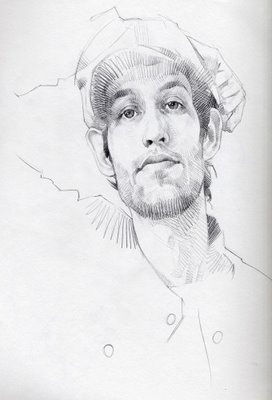
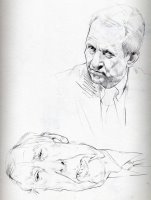
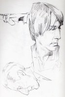
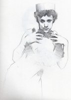
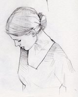
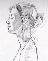
 I attribute any art talent I have to my sketchbook. I've spent most of my freetime in my sketchbook for the last 12 years of my life. I look through any magazine I get my hands on, looking for interesting faces and anything I can draw. Mostly I focus on the faces, I think thats the hardest thing to get because everyone has seen so many faces they can identify any problems. Here's a few pages from my current sketchbook.
Labels:
Drawing
Subscribe to:
Comments (Atom)


