Monday, August 29, 2011

*fig. 52

I got a bit of push back last time I said this but think that in my opinion this is my best figure drawing to date. That is not to say it is the one you would want to hang on the wall but to me it is the furthest along the path to where I want to get with my figure drawings. I think the proportions are accurate and a good range of shading but also an appropriate line vs. chiaroscuro balance.

This was a 2 hour drawing which unfortunately ended about 10 minutes earlier then I was pacing myself toward. So the lower legs aren't as polished as I would have liked. Again using Nu pastel and Conte but I got myself a medium gray shade of Nu pastel instead of the Bottle green or Cordovan I typically use. It is less workable, harder to erase but I like the look the Conte/Pastel transition is also smoother.

Wednesday, August 24, 2011

reading

A sketchbook drawing, I toned it and added highlights in Photoshop.

Monday, August 22, 2011

these hands


A digital painting, for your enjoyment.


I did the drawing in a meeting. It is pretty typical of the style that comes out of my mind when I am bored with nothing other than a pencil and paper to entertain me.

Tuesday, August 16, 2011

fig. 51

I've had a pretty good run with figure drawings working out here for a few weeks. One thing I'm starting to get frustrated about is the generally stiff feeling I often get. I think a lot of it is the model who's sitting there for nearly 2 hours.

Pay no attention to that dead fish hand on his stomach, it is accurate.

Thursday, August 11, 2011

Carry on

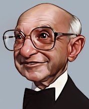
Another for The Weekly Standard a few weeks back.

Monday, August 08, 2011

Figure drawing steps

Finally got a few step-by-step pictures from a drawing session. Please excuse the awful quality, I love my little phone but its been scratched up, shaken, soaked, etc for a few years now.

Step #1-
Blocking in of the general shapes along with working out the spacing on the page and composition. Done with a Nu-pastel which is soft and easy to erase. I keep it light so mistakes are easy to fix. Measuring is important at this point. Get something on the paper that you can judge.

Step #2-
Still with the Nu-pastel I refine my shapes and work out the edges.

Step #3-
Once I feel like I'm close I go through and outline with Conte. Outline all the features and any hard edged shadows. I like this because the Conte is much harder and hard to erase so I can put in some heavy values and wipe with a paper towel and the line work will stay. Be very careful with small details like the eyes because like I said it is hard to erase if you are wrong, make sure you are right before you use the Conte.

Step #4-
So I've got the drawing lines, I go back to the Nu-pastel and color in all the shadows and the dark areas then wipe it down, go a little overboard with this. Next I come back with a kneaded eraser and start pulling out the light areas with a pink eraser available for the sharp clean edges. Then I return to adding darker values but more limited way and brighten the highlights as they get toned down.

Step #5-
Details. I've got a sharpened Conte piece that I use for the sharp tiny lines and places I really want to give strong darks.

Thursday, August 04, 2011

.5 machine

Done for the Avalanche blog topic "Cyborg".

Monday, August 01, 2011

Slayerette

I've been poking around with Adam Hughes painting style which is interesting and I think I like it. Most of the value is added in the drawing stage then areas are colored in photoshop. I wanted to draw something up real quick and practice with it and it turned into a very nice finished piece I think. I leaned into his area of pretty comic book heroins a bit and I rarely draw monsters. For reference here is the original drawing: