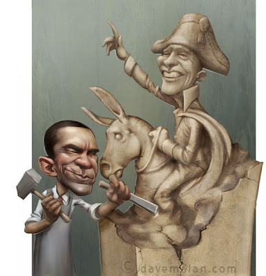
 An illustration done for The Weekly Standard. The more cartoon style helps make a really quick turn around a little more manageable. This is Mr. Obama working away with his hammer (no sickle is visible).
Monday, April 19, 2010
Sculptor
 An illustration done for The Weekly Standard. The more cartoon style helps make a really quick turn around a little more manageable. This is Mr. Obama working away with his hammer (no sickle is visible).
Labels:
Digital Painting
Subscribe to:
Post Comments (Atom)

18 comments:
Awesome in many ways!
real nice.. love the style. How long did it take?
Congrulations....kkkkkk
Did no one get that yet, Dave?
fantastic! its a pleasure see your artworks.
haha! no sickle is visible.. fabulous.
I LOVE your Weekly Standard stuff, Dave!
Thanks a lot guys.
Ken, this was probably 5-6 hours.
congratulations!
Dave, do you think you're getting better? Could you have done something like this say... 7-8 years ago? Looks terrific!
Tom,
No, it's hard to say. Maybe I could have done about 75% of this level. You still waiting on that little baby? I think I found that tablet I was talking about. I'll make sure and let you know.
Love it!
yeah, still waiting. due date was this past sunday. getting antsy
Nice looking image.
Yet, I feel it is fear of the black (in this case the sickle) that keeps some stubbornly in the white. While it is almost always a shade of gray that best answers the problems we face.
Best wishes.
I do like the cartoon style here. Great work.
There is a hidden sickle there! It's under Obampoleon's cloak. Absolutely amazing artwork overall in your blog. I have a question (a burning problem of mine, yet unanswered): my sketches look always much much better than the finished artwork. I'm not ashamed, since I noticed the same effect in Leonardo's works. Does it happen to you too? Why is this?
Graphite, I don't know. My drawings are definitely my strong point. Often if I intend to paint it I am pretty loose with the drawing so it doesn't look too great.
The answer though is probably has to do with all the elements that you have to deal with in a painting. In a drawing you just have a limited number of problems to deal with, painting adds color problems on top of it. It's like driving and cooking at the same time, it's hard.
Driving and cooking, ha ha! great words for one like me, who's a disastrous cook and can't drive (true, I hope to never become forced to learn it, or to eat what I accidentally cooked...). Your works remind me Michelangelo's words about sculpting: "I look at the marble block until I can see the statue in it. Then I take out what's NOT the statue". Yout elegant lines give the same feeling: they just trace the border between what is and what is not.
Post a Comment