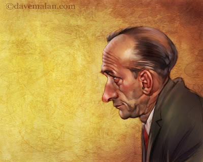
Here is the final step with it's finish piece. I guess it loses the impact seeing all of the steps leading up to this finish, but I like the background texture. This was finished with just a few layers set to different opacity's to add color and atmosphere. It feel like it needs some text in the negative space(don't worry I wont add any).
I almost forgot, props to Joe Olsen for his brilliant drawings used subliminally as background noise.

8 comments:
Turned out nice. I wouldn't add any text. Looks good how it is.
I agree. I think text would actually take away from it.
Love seeing the progression too. I don't think it loses it's impact at all. AWESOME!
Maybe you are right, both composition and the character eyes lead the eye to the left. But as joe say, it looks good this way too, makes me remember the dog painted by goya here:
http://goya.unizar.es/InfoGoya/Obrasjpg/Pintura/613.jpg
Fabulous stuff - thanks for sharing the process too! Super
Very nice. Your confident strokes are so refreshing.
Sweet piece man, I really dig the colors in his face, nicely done!
Beautiful work on this man. It reminds me of another side of Frazetta like when he did a portrait/charicature of Ringo Star. The way you make the colors and forms look easy amazes me.
cheers
Mario
Your work is gorgeous, David. I'm really enjoying your blog. :)
Post a Comment