
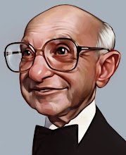
A recent piece of freelance work. It's a pencil drawing on illustration board. I decided to leave the pedestal he is sitting on unshaded as a design decision, a little more graphic. Tell me if you think it was a good decision or not.
A refrigerator for my Artwork.
17 comments:
wowowo excellent work dave!
I like it white. It is a great drawing. I love how happy he looks. however, there is a sneaky shadow in between his right leg and the rope that should probably go. It makes the rope look like another bone.
wow, this is impressive, Dave. I think you took the right decision with the pedestal, like this our eyes are directly focusing on the main element and the composition "breathe" as we use to say in french.
Very awesome Dave! I too really like your graphic choice here! It directs the focus to where you want it to go, also pulls it all together nicely. Great Job!
Right decision, and its one of the best drawings I saw in last...I dont know... months, probably.
Nice drawing. Great contrast, it stands well as it is.
Dave,
Way cool. Good thought on the white pedestal. You would hate for it to detract from the details of the skeleton. Glad to hear you are getting freelance work.
-Hunter
I love this one, Dave. Great pose and shading and contrast and... oh, wait. Oh, wow - the pedestal sucks! I'm lying, though. I think it looks nice that way. Great sketch, sir.
I think it looks great.
It makes the subject stand out more.
Great job.
Yep - good decision - brings focus to the main subject - great pencil work!
Yes, good decision, unless you were charging by the pencil stroke, in which case you should cross hatch the whole thing black.
Man, I was all ready to write my comment but it appears as though everyone is in agreement... and for the same reason. A GREAT decision, the contrast is poignant and the subtle shadows are also nice. Fantastic art work.
I think this might be my favorite sketch of yours ever.
he he he he ......Gr8!!....Always curious abt ur Work n work stile!!
Hi,
Sure, that's a good decision!
Best regards from Vancouver :)
Hi,
I am an illustrator from India, and your work is truly inspiring i was feeling a bit stagnant but your work
raised my energy level to work hard,
as far as this illustration is concerned your decision is right
sudeep
quite amzing work along with a nice thinking also.I preity like your work so can you tell me....... making a caricature needs what kind of observation?
Post a Comment