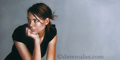
 Finally the painting of this previous drawing. I like to paint them then they sit around for a few weeks while I decide whether I like them or not. I am okay with this one, but I took this picture using the flash from the edge and really like the light right side progressing to dark(the actual painting doesn't have that effect) so I think I will get back and rework the background. I would be happy to hear peoples opinions.
Tuesday, April 03, 2007
Gray
 Finally the painting of this previous drawing. I like to paint them then they sit around for a few weeks while I decide whether I like them or not. I am okay with this one, but I took this picture using the flash from the edge and really like the light right side progressing to dark(the actual painting doesn't have that effect) so I think I will get back and rework the background. I would be happy to hear peoples opinions.
Labels:
Oil Painting
Subscribe to:
Post Comments (Atom)

16 comments:
very nice. her eyes looking into the darkness gives it a contemplative mystery, her facial expression compounds that. nicely done, as usual.
Well Dave, juste because you told us about the background, I focused on it, and as said before, it looks great like this and the dark background isn't dark enough to evocate any kind of "menace".
and, nothing about your painting but I was wondering that if the dark part of the back ground was on the right and the clear on the left the subject will "shine" a little more, dunno if I'm clear enough (excuse my english), the clear background surrounding the dark part of her face.
and your painting skill are still so impressive, Dave, and if it's not obvious at first sight, you're a major influence for me, so keep up sharing your art with us!!
I have lots of opinions you'd certainly love to hear, but none of them have anything to do with this painting. Okay... I do have one opinion about this painting, and that's that it's really incredible... of course, that's just an opinion.
God ... I really want to give you my opinion, but ... How could I say in english ^^ ...
Okay, I'll think about it ( i'll find someone who have a better english than me ;) ) and I'll come back ^____^
Wow, and I thought I liked the drawing. As far as the background goes - I like the gradient in the photo, the light to dark thing works but the space feels a little awkward like there could be a crop at the edge of the "m" in .com? Maybe if you painted the gradient in it would fix itself? But hey if I am shouted down by my fellow commenters I will hike back to my cabin in the woods and not bother anybody. Great work as always.
Beautiful as usual dave. i can't find enough adjectives to describe your stuff.....how about.... stupendous!?
A beautiful piece of art. I've just discovered your site and blog, a real pleasure to look at. Your technique is great !
Wow, this is fantastic. Very nice gesture and weight. I like the composition you have going already. I think it looks great the way it is. The only thing that would make it look beter would be about 4 more inches added to the back of the head. What is it about another 4 inches that I find so awsome.
Great work David! I love what I see on screen! The gradient the camera caught is nice because it is subtle - you should be proud of this piece!
Dave- This thought may be late in coming. First- great job. For me- I'm thinking black background- coles pillips style- possibly with nice bright rim lite, backlit ffrom the left side, this can go on the shirt and hair to seperate from the black or just on the skin. could be hot- i could be an idiot too. That's my opinion- happy to give it. you may have just wanted an opinion on the graded background vs. flat, if that's the case I like what you have here.
well well well! Master Malan did it again!
Great piece Dave!
David,
I really like this piece. It happens that I saw it while picking up my rejected painting from the Spring Salon, and distinctly remember wondering what it was doing in the basement instead of on the wall.
Bryan Larsen
Hi Dave,
Wow, this is such a beautiful painting. The girl in it is soooo expressive. It makes me want to invent a backstory for her - she's at a cafe waiting for a late date perhaps. Nice work. Added a link to your site and blog if you don't mind. Sara
Nice! Nice site! Good resources here. I will bookmark!
Excellent website. Good work. Very useful. I will bookmark!
I see first time your site guys. I like you :)
Post a Comment