 You may recognize this painting as a color version of this previous painting. I thought it would be a great idea to do a black and white painting to get all of the values out of the way before I started into the color beast. I learned that is not a good way to paint. I went over the face with the colors then continued onto the rest of the painting only to discover the face was very very gray. So basically I ended up doing 3 or 4 layers of paint to get what I wanted. The black and white underpainting turned into a huge time waster, maybe it could work with a sepia tuned value study?
Monday, January 08, 2007
Kristina
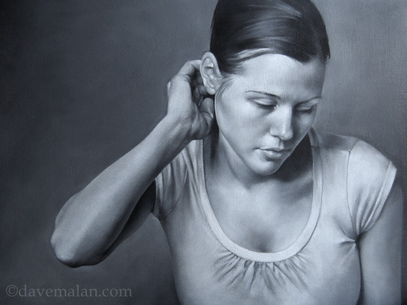
You may recognize this painting as a color version of this previous painting. I thought it would be a great idea to do a black and white painting to get all of the values out of the way before I started into the color beast. I learned that is not a good way to paint. I went over the face with the colors then continued onto the rest of the painting only to discover the face was very very gray. So basically I ended up doing 3 or 4 layers of paint to get what I wanted. The black and white underpainting turned into a huge time waster, maybe it could work with a sepia tuned value study?
Subscribe to:
Post Comments (Atom)

14 comments:
Hi Dave, I don't know for the others but I don't see any image on this post...
I see it.
Funny, but I've heard many, many people recommend doing the values first. Then again, I seem to remember they were mostly people using Photoshop. I do seem to remember a few "traditional" painters also working that way, but as I recall they always worked with some sort of warm color (burnt umber?), and what happened to you may be why.
By the way, don't listen to me. I really don't know what I'm talking about. ;-)
Thanks Anders, it should work now. I thought you could just imagine a painting, it might look better that way.
Colin I think your right. It's probably the black and white color that hurt me, somethin warmer would have worked better especially with the warm tone of the final project. Maybe the rule should be "don't do a cool underpainting to a warm piece".
Fantastic picture - thanks for showing your experiments with colour this way! I know many people underpaint values in earthy colours - due to the translucency of colour. Some of the old masters would paint values in greens I believe - before adding layers. In any case this is fab
I think the french would use grey and violet a lot for underpaintings. Not sure how they escaped the effect you speak about. I know it's never as simple as transparent glazing on top, tho. I've had some success with splitting the difference tween cool and warm with a raw umber - like B&W without the edge.
Whoa! Sorry, can't think of anything else to say . . .
Hi david - the following link mentions Vermeers underainting colours - and the footnote mentions green was used by medieval painters to neutralise the pinks/fleshtones:
http://vermeerspalette.20m.com/index.html.htm
also this link mentions several methods of layering colour:
http://rourkevisualart.com/wordpress/2006/09/24/renaissance-layering/
Thanks all, I just need more practice.
Thanks a lot Tim, those are great links.
Holalaaaaa!
All your lasts posts are!!!... Woaw!!!!!
woaw!!!!
Dave you continue to astound me.Your work is lovely and always inspiring. I look forward to every new post you put up, especially your realism paintings.BEAUTIFUL!
This is beautiful.
Wonderful works!!I think that the grey base is a good way to understand the deep and the different tones, but it's a very difficult way, and for some things isn't good, so, great works!compliments!!!!very wonderful blog!
Yep... what to say... still impressive.
Post a Comment