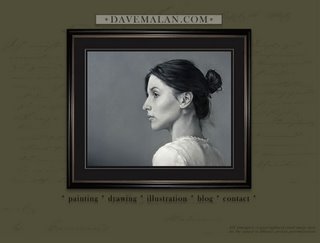
 I have just finished a redesign of my website with some newer art but especially a new design. I would like your input on the changes, especially if you are familiar with the old site. Also, I've heard rumors of it not working for some on Macs, but my it works on my Mac, so if you have problems please tell me. Visit it here
well Dave, it works on my Mac...
ReplyDeleteand as I told you before, great new design!!
Looking good. Love the drawings section. I do miss 2 of the images you've posted here - "frustrated" and "no comment". I've always thought they were quite strong.
ReplyDelete2 cents.
HEy Dave,
ReplyDeleteYou don't know me, but I am one, of I'm sure many people, who look at your blog regularly, who's never gotten ahold of you. So here I am. Just thought I'd let you know that it works on my MAC. I definitely like the new redesign, looks good.I like the B&W paintings a lot. But because I am an artist I would always like to see bigger images, so I can get their and really look. I am a fine artist mostly and paint for a living mainly, have a look, www.studioflint.blogspot.com. Anyways, I like your stuff thought I would let you know.
you're work is really inspiring! ;, works on my mac too!
ReplyDeleteThe rollover image viewing is perfect. Your paintings are something to marvel at, too. I got caught up in looking at them...forgot to look at the website itself (which is probably a good thing!)
ReplyDeleteExcellent work here David!
ReplyDeleteThe new site is wonderful. The only thing that I found a little disconcerting was the way the hovering the mouse over the thumbnails in the galleries made the image appear, while clicking does nothing. I was sort of expecting clicking to do something (a larger image or detail image maybe?), especially since the cursor appears as a hand.
ReplyDeleteThis is using Firefox 2.0 on a Windows PC, by the way.
I like the new site, it's working really well. Very clean presentation of some great artwork!
ReplyDeleteI like the redesign a lot. It looks more professional than the old version. Navigation is easy and intuitive. Nice job.
ReplyDeleteDave, I love your new site. very clean and smooth...and it really helps that your artwork is so stinking good.
ReplyDeleteglad to have found your blog and site. you have some wonderful work.
ReplyDeleteYou site looks great, your paintings are incredible and I really enjoyed visiting your blog. I have to say my favorite is the black & white painting of your little sister. It is simply beautiful.
ReplyDelete